Android gets a logo makeover with a capitalized "A" in its branding
Four years since its last logo overhaul, Google is bringing a more reflective look to the new Android logo as it announces a makeover for the latter. According to a blog post by Google, the updated Android logo is inspired by the Material design to "complement with the brand palette, as well as be adaptable."
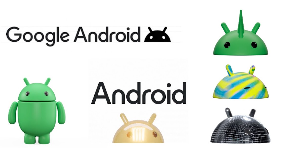
The new Android logo sees a subtle change in its branding with a capitalized "A" instead of the lowercase stylization of the "android" text we have seen throughout the years—this design shift gives Android a more intuitive look thanks to the added weight, curves and a brand new personality unique to the Android robot.
 |
| Image credit: Google |
In addition to the new branding text, the search engine giant is giving the Android robot an entirely new 3D look, with "more dimension, and a lot more character."
"We've also updated the robot’s full-body appearance to ensure it can easily transition between digital and real-life environments, making it a versatile and reliable companion across channels, platforms and contexts," Google added.
The new Android logo will make its way to current and new Android devices and will also start appearing in "more places" later this year.
Source: Google Blog

Four years since its last logo overhaul, Google is bringing a more reflective look to the new Android logo as it announces a makeover for the latter. According to a blog post by Google, the updated Android logo is inspired by the Material design to "complement with the brand palette, as well as be adaptable."
The new Android logo sees a subtle change in its branding with a capitalized "A" instead of the lowercase stylization of the "android" text we have seen throughout the years—this design shift gives Android a more intuitive look thanks to the added weight, curves and a brand new personality unique to the Android robot.
 |
| Image credit: Google |
In addition to the new branding text, the search engine giant is giving the Android robot an entirely new 3D look, with "more dimension, and a lot more character."
"We've also updated the robot’s full-body appearance to ensure it can easily transition between digital and real-life environments, making it a versatile and reliable companion across channels, platforms and contexts," Google added.
The new Android logo will make its way to current and new Android devices and will also start appearing in "more places" later this year.
Source: Google Blog

